Come Join Us
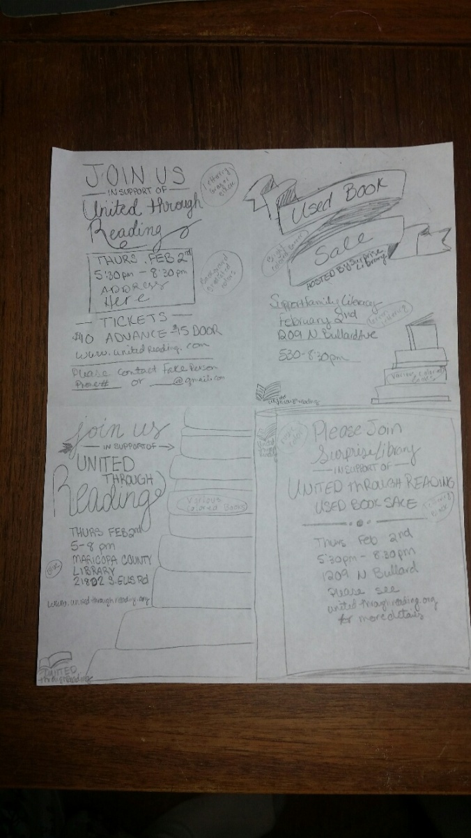
Come Join Us

 Process: First I tried finding a picture to match my comments, but found nothing that would match appropriately. Next I looked through pictures to see what struck me, again nothing worked out. Finally I thought of subject matter I valued and searched for pictures and found a beautiful picture, which I easily found a quote for from an old Ensign article. My typography could be appreciated by young and old audiences alike. I copied the image into Microsoft Word and began testing different font styles and colors. The internet makes a font search simple. I typed in “laughter font” and found the “snickles” font that fit my subject matter perfectly. Using the color wheel I found coordinating colors for my text. Trying to find a design element took a little time. I wanted the design to be youthful, but not immature. Thinking of polka dots I came upon my design element which enhances the text nicely.
Critique Report: I critiqued Elsa Christina Sanft Mills and Robert Prince’s projects. I received critique from Shannon Miller and Kaylan Burns. Both critiques suggested I change the color or font of the text as it was hard to read. I do agree that it was a little hard to read, but I was trying to repeat the color of the child’s clothes in the text color. Brother Shurtliffa our instructor also indicated in his critique that a color change in the text would be helpful. He also suggested moving the title, so that it lined up with the body of the text. Along with changing the color I moved the body down on the page so everything was not so central in the picture
Links to Images: http://www.mumslounge.com.au/lifestyle/children-say-funniest-things/
Font Name/Category: Title: Snickles, sans serif. Body Copy: Georgia, modern
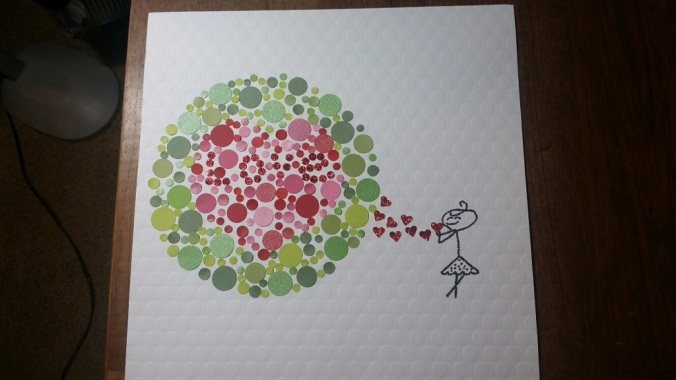
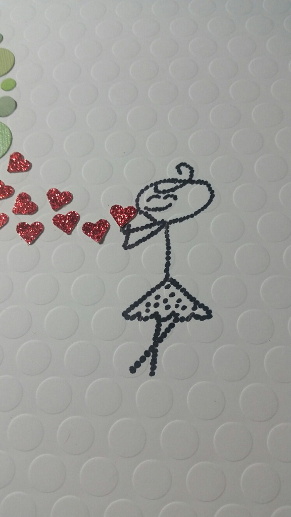
I love Polka Dots, so creating a picture with circles was a natural choice. As I shopped for colored paper I also found white paper with circles as a back drop. This added to the repetition I used in creating the picture, even down to the circles that made the stick girl. The girl is placed in close proximity to the “Love Bubble” which she created by blowing kisses and expressing love. There is great contrast in both size and color between the two subjects which gives interest to the picture. The large focus of the picture is aligned to the left drawing attention to the smaller figure on the right. I am not an artist, so my picture was merely trying to create a sweet picture of my granddaughter blowing kisses and this developed.
