“Magazine Spread InDesign Project”

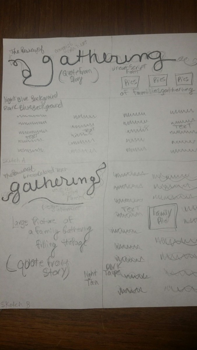
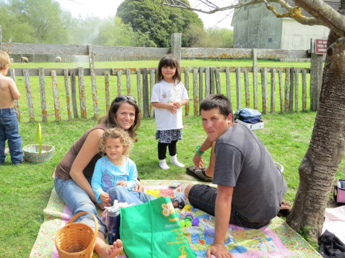
Process: In creating my magazine spread, I began by writing an article on a topic that has deep meaning for me. I chose the topic of “The Power of Gathering.” My children are grown and two of my children are inactive which saddens me greatly. However, we continue to love and encourage them to participate in family gatherings, including a monthly FHE without the whole family. If nothing else my children know and feel loved as we gather as a family. My hope and prayer is that those feelings will bring them back to the church when times are difficult for them. I know I am not alone in having inactive children, so my target audience would include parents who are looking for ways to help a wayward child. When they will no longer listen to your counsel, all you can do is love them, and gathering as a family as often as you can demonstrates this love. After completing my article I found a font for my title. This may seem to be out of order, that maybe I should have found my pictures first, but I had noticed on Pinterest a beautiful script of the word “Gathering” and knew it is what I wanted to use. Interestingly enough, I had to change the font slightly to work in the space allotted in the spread. I chose a picture of a family on the beach because that is where we gather as an entire family every summer. To make the picture work for my magazine spread, I had to resize, and edit the picture in Photoshop to fit in the space correctly. It was difficult to adjust the picture to work across two pages. When working in InDesign I had to figure out how to use the connecting frame text boxes. It was a life saver, but took a while to figure out.
Critique Process: I critiqued Josef Carstens and Elissa Turpin’s projects. Critiques were received from Sandra Zulema Mancilla and Constanza E. Dennis. Suggestions were made to watch my orphans and widows and to align the end of my columns. After many changes in the text area no orphans or widows were left. As far as the alignment on the right side goes, I verified that the Ensign does not align both sides of the columns to fill the space. I received a general critique from Brother Shurtliff along with the rest of the class, giving common mistakes being made. Further, I received an individual critique from Brother Shurtliff suggesting I bleed my images, add page numbers, and change my fonts. After making those changes I submitted another draft to Brother Shurtliff to critique again. I received an additional critique and changed the formatting of the big first letter of my text, removed the outline of the different boxes, and made some other font changes.
Fonts: Body – Serif – Minion Pro, Title – Decorative – Lucinda Calligraphy and Sans Serif -Segoe UI, Side bar text body – Sans Serif -Segoe UI, Side bar text title -Serif- Minion Pro, Page numbers and text Sans Serif Segoe
Picture Sources: Family on the beach, Elder Hales


